Why CRI Matters in Lighting Design: The Hidden Detail That Brings Your Home to Life
- Kenny Zhuang
- Jul 6
- 5 min read

Estimated Reading Time: 8–10 minutes
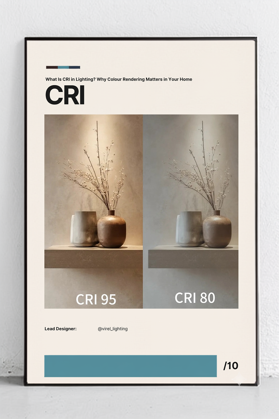
"When colours lose their life, spaces lose their soul."
When choosing lighting for your home, most people focus on brightness, wattage, or the appearance of the light fixture.
Will it be bright enough?
Should I choose warm white or cool white?
Does this fixture match my interior design?
These are all important questions—but they overlook one of the most influential characteristics of quality lighting.
Colour Rendering Index (CRI).
It isn't something you'll immediately notice on a product box, yet it has a profound impact on how your home feels.
From the warmth of your timber flooring to the richness of your marble countertops, the vibrancy of your artwork, and even the natural tone of your skin, CRI determines whether colours appear true to life—or dull and lifeless.
In many ways, CRI is the difference between simply illuminating a room and allowing your home to be experienced exactly as it was designed.
What Is CRI?
CRI stands for Colour Rendering Index.
It measures how accurately a light source reproduces the colours of objects when compared with natural daylight, which serves as the reference standard.
The scale ranges from 0 to 100.
The closer the value is to 100, the more accurately colours appear under that light source.
Think of CRI as the "truthfulness" of light.
A high-CRI light allows materials, finishes, fabrics, and colours to reveal their authentic appearance.
A low-CRI light can make the exact same space feel flat, washed out, or even slightly unnatural.
The furniture hasn't changed.
The paint colour hasn't changed.
Only the quality of the light has.
Yet the room feels completely different.
Brightness Doesn't Equal Better Lighting
One of the biggest misconceptions in residential lighting is that brighter automatically means better.
In reality, brightness and colour accuracy measure two completely different things.
A room can be extremely bright while still making colours appear dull.
Imagine purchasing a beautiful oak dining table after carefully selecting its warm natural grain.
Under poor-quality lighting, those rich wood tones may suddenly appear grey or lifeless.
The same applies to:
Natural stone
Marble surfaces
Timber flooring
Artwork
Indoor plants
Textured fabrics
Decorative ceramics
Even skin tones
Without accurate colour rendering, many of the details you invested in simply disappear.
Good lighting doesn't only help you see.
It helps you appreciate what you're seeing.
CRI 80 vs CRI 95: Why the Difference Matters
At first glance, the difference between CRI 80 and CRI 95 may not sound significant.
After all, it's only fifteen points.
In reality, the visual difference can be remarkable.
CRI 80
Lighting with a CRI around 80 is commonly used because it meets general lighting requirements and is often more economical.
However, colours can appear slightly muted.
Wood loses warmth.
Textiles appear flatter.
Artwork lacks depth.
Natural materials lose much of their character.
For everyday functional spaces, CRI 80 may be perfectly acceptable.
But for carefully designed interiors, it often doesn't showcase the space at its best.
CRI 95
High-CRI lighting reveals colours with greater richness and accuracy.
Timber appears warmer.
Stone surfaces reveal subtle textures.
Paint colours remain true to their intended shade.
Indoor plants look healthier.
Food appears more appetising.
Even people's skin tones appear more natural and flattering.
Rather than simply making a room brighter, high-CRI lighting brings the entire space to life.
Why Interior Designers Care About CRI
Interior designers spend months selecting materials that complement one another.
Every paint colour.
Every timber finish.
Every fabric.
Every stone surface.
Every decorative object.
These decisions are carefully considered.
Poor lighting can undermine all of that work.
Imagine selecting the perfect warm beige paint, only for it to appear dull and grey once the lights are switched on.
Or investing in beautiful walnut cabinetry that suddenly looks flat under low-quality lighting.
The design hasn't failed.
The lighting has.
That's why professional lighting design isn't simply about selecting fixtures.
It's about ensuring every design decision is presented exactly as intended.
Where High-CRI Lighting Makes the Biggest Difference
Although high-CRI lighting benefits almost every environment, there are spaces where it becomes especially important.
Residential Homes
Your home should feel warm, comfortable, and authentic.
High-CRI lighting enhances everyday living by allowing natural materials and finishes to reveal their full beauty.
Hospitality
Hotels, restaurants, cafés, and lounges rely heavily on atmosphere.
Warm, accurate colours encourage guests to feel relaxed and comfortable.
Retail Spaces
Retailers want customers to see products exactly as they are.
Whether it's clothing, cosmetics, jewellery, or furniture, accurate colour reproduction improves confidence and reduces disappointment after purchase.
Art Galleries and Museums
Artists create their work under natural light.
Displaying artwork under poor colour rendering changes the way people experience it.
High-CRI lighting preserves the artist's original vision.

Is CRI 100 Always Necessary?
Not necessarily.
Natural daylight has a CRI of approximately 100 and serves as the benchmark.
However, modern LED technology has advanced to the point where many premium fixtures achieve CRI values of 90 to 98.
For most residential projects, CRI 90 or above offers an excellent balance between performance, colour accuracy, and efficiency.
The goal isn't to chase the highest number.
It's to choose lighting appropriate for the space and the experience you want to create.
CRI Is Only One Piece of Great Lighting Design
Although CRI is incredibly important, it should never be considered in isolation.
Exceptional lighting design considers several factors together:
Colour temperature
Beam angle
Glare control
Layered lighting
Light distribution
Dimming capability
Architectural integration
Natural daylight
A high-CRI spotlight installed in the wrong location can still create an uncomfortable space.
Likewise, perfect colour temperature won't compensate for excessive glare.
Great lighting is never about one specification.
It's about how every element works together.
Choosing Lighting Beyond the Specification Sheet
It's easy to compare products by wattage, lumen output, or price.
These numbers are important.
But they don't tell you how your home will feel.
The real question isn't:
"How bright is this light?"
It's:
"How will this light allow my home to be experienced?"
That's the difference between buying lighting and designing with light.
When lighting is thoughtfully planned, it doesn't compete with your architecture or interior design.
It quietly enhances everything around it.
Final Thoughts
Beautiful interiors deserve beautiful light.
Whether you've invested in natural timber, carefully selected paint colours, textured stone, or handcrafted furniture, every design choice deserves to be seen as it was intended.
CRI may be a technical specification, but its impact is deeply emotional.
It influences how colours are perceived.
How materials are appreciated.
How comfortable a room feels.
And ultimately, how people experience your home.
Because lighting isn't simply about visibility.
It's about revealing the true character of every space.
The next time you choose a light fixture, don't just ask how bright it is.
Ask how truthfully it reveals the world beneath it.
That single question can transform the way you experience your home for years to come.
Comments